Thermal Orthographic vs. Individual Images
Comparing thermal orthographic processing to individual images.
by Malcolm Davidge
Comparing thermal orthographic processing to individual images.
Photo by Ryan Searle on Unsplash
When conducting a Visual and Thermal inspection of a PV Solar by uAS (drone), the data can be collected in a variety of formats.
– Video
– Individual images
– Stitched images (orthomosaic map or model)
These are processed in different ways, all of which have
their inherent pros and cons.
We thought it would be interesting to compare thermal orthographic (stitched images) and individual images, examining flight times of data collection and comparing resulting deliverables.
To level the playing field, we start with a small field of approximately 1.5MW, which will typically cover an area of 150,000 square feet or 13,935 Square meters. Within this solar field, we have already established a selection of anomalies.
By collecting many overlapping images, and processing them in some very clever software, your visual and thermal images can be stitched together to create an orthographic or ‘map’ of the solar farm. This can be delivered in both a colorized visual map and a thermal map.
You may be wondering, what are the advantages of conducting a PV solar farm inspection as an orthomosaic map? In all actuality, an orthomosaic 2D map or 3D model of your solar field is great for accurate measurements of the site, a section of the system, even down to measuring the distances between rows, or other structures.
These are typically used in pre-construction development of a site to understand the actual terrain or “lay” of the land that is being developed for the solar installation. An additional advantage to having the 2D/3D map/model is for presentation purposes to management, investors, or marketing campaigns.
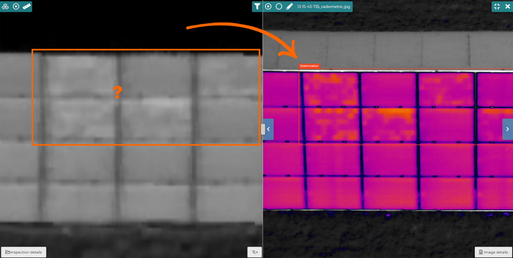
However, with an inspection, the imagery in an orthographic map, tends to be lower resolution, and therefore difficult to analyze fully. The RGB (visual) data that is needed, to confirm if a hotspot is worthy of a visit by an engineer (or just the side effect of bird soiling for example), would also need to be collected, often with another flight. It should be processed and analyzed in tandem with the thermal map.
The following images illustrate the types of differences that can be
observed between the 2 methods and heights. Not all solar farms are
the same, and so results will naturally vary.
This flight was programmed to collect images with a 62% side lap and a 75% front lap. The imagery is at 6cm GSD. Resulting in 389 images being captured in 16 minutes and 11 seconds.

The modules need to be inspected during sunny conditions. This means a constant battle to strategically avoid the sun’s glare reflecting from the modules while capturing consistent high-quality imagery. Glare can disrupt the software from matching and stitching images.
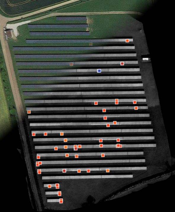
The video above shows the flight route and the resulting ‘map’. There’s no denying; it looks really good.
Most of the anomalies can be seen, and it is easy to overlay a layout diagram to report the location.
The RGB data that is needed, to confirm if a hotspot is worthy of a visit by an engineer (or just the side effect of bird soiling for example), would also need to be collected. Often with another flight.
It should be processed and analysed in tandem with the thermal map.
This ortho was processed using the Rjpegs and is not radiometric. To be able to analyze temperature deltas in the ortho, the data would have to be processed using radiometric TIFF files and suitable software.
By spending a little bit more effort on flight planning, we can program our UAS (drone) to capture images at precise and incremental positions. The flight route must be more precise, and the payoff is huge when you compare the amount of MW you can survey per flight.
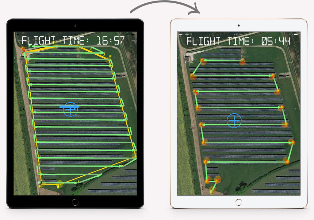
The image below shows my flight plan for the thermal ortho, compared to that for the ‘3-row’ flight.

As there is no need to try and stitch the images, no overlap was required (sidelap) and the focus is on keeping the rows squarely framed in each shot. Each image overlaps slightly (frontlap) at around 20%, just to ensure that no modules are missed. This can be increased to 50% if necessary, to negate glare.
This flight took just 5 minutes, 44 seconds and created 45 images. As the flight was at the same height and therefore the same 6cm GSD, the results were similar.
With the time saving we achieved, we repeated the inspection flight, but change the parameters to survey 2 rows of modules per sweep. This flight only took 7 minutes, 57 seconds and recorded 76 images.
A good workflow is needed to report the position of the modules.
The improved GSD of over 30% gives much better resolution and clarity on both the thermal and RGB data. Each jpeg is radiometric and can simply be worked on for in-depth thermal analysis.
Encouraged by the time savings and improved results of the 2-row survey, we ran another mission for 1 row.
This flight took over 24 minutes and did not cover the whole sample
site.
It is double flight-length compared to the 2-row route. Another consideration is, that this level of flight must be performed at a slower
airspeed, to avoid motion blur in the data.
The data looks great, but localizing the fault is challenging.

The advantage of this type of close inspection flight is ideally used to inspect an area of modules, which are known to have subtle latent defects such as snail trails or PID.
The RGB data was recorded in the same flight, which is adequate at
best.
Thermal orthographics look nice and are easy to fly. But the amount of data and flying required, is substantial.
There are obvious restrictions to the achievable quality and post-processing.
Not only does it become financially unfeasible to collect and process high-resolution data, but stitching software tend to struggle to process images that have been flown from a low altitude, particularly without ground control points.
In my opinion, this workflow is suitable where more obvious faults need to be analyzed, and flights are conducted at a high level. For clients who require more detailed results, significant improvements to the data quality can be gained by flying lower and using an individual image inspection workflow. Additionally, substantial time savings can be made in the field, and on post-processing.
When compared to the orthographic method, the 2-row route:
– Reduced flight times by over 50%
– Improved data quality by more than 30%
– Processing was considerably faster
– Required 80% less data
More content from us
Enter your details below to continue
First and last name is missing.
Company name is missing.
Phone number is missing.
Email is missing
I have read the Terms of Use and declare that I agree
Missing accept for our Terms of Use
Please send me occasional e-mails about the product.
14 Days free trial starts automatically when you sign up